Page of Shame
The good thing about this theme was that it generated a lot of really clever and comedic images. The bad thing was that, like all weeks, it brought a share of crap to the table as well. Some people just couldn't grasp the idea of trying to make their images look cohesive, as in making the various celebrities they pasted in look like they were actually a part of the painting. That can be difficult, but most people did a good enough job without any problems. Some, however, just did very poorly. Please join me as I unfairly point out the shortcomings of these people in hopes that they will either strive to improve their work, or hang themselves with an electrical cord.
What can I say about this Andrigaar picture that doesn't involve obscenities? I've seen a lot of odd Photoshops come my way, but usually never ones that involve scary red food coloring splotched all over. If that's blood, well, it's way too bright. If not for the fact it doesn't really conform to the perspective well, I'd say it looks more like somebody got themselves a jumbo container of Kool-Aid mix and accidentally spilled it all over the place while running from a sugar-crazed raccoon. The other stuff added in, apparently to make it look the sight of an attack of some sort, doesn't really work either. I've seen Barbie Doll dioramas that look more gruesome and intimidating than this. I've made Barbie Doll dioramas that look more gruesome than this. |
The problem with this image by Araya is that it suffers from being really, really shitty. If you take notice of the original painting, at least the parts unedited by Araya, you will note that it is painted in such a manner as to look fairly realistic and convincing. The problem with the crap she added in is that it's very flat and 2-dimensional. The result of this mangling of styles is something that looks like a toddler's imagination smeared across the highway after being hit by a drunk driver's imagination. The goal here, my precious readers, was to edit the paintings in such a manner that what was added looked like it really belonged there, even if it really didn't belong there. I don't know why so many people are so oblivious to the notion that 2-dimensional art from games, cartoons, and comics really doesn't look good pasted into paintings or pictures without sufficient editing. Quick set of advice to potential Photoshopkateers: use your eyes to see if what you made looks awful or not. |
I think this FWTecman picture would have looked nice if he would have taken an additional 10-20 minutes to work on blending the Monty Python guys into the scene. Since the painting is a painting and the Monty Python guys are real people, they need to be edited so that they appear to be painted, much like the painting behind them. This may seem like rocket science or even witchcraft, but a couple of Photoshop filters would have probably done the trick okay enough. But no, when it came time to making this look like a cohesive image, FWTecman decided to take the path less traveled: being a huge fag. Way to go guy, I hope those twenty minutes you saved not fixing this image up went to good use. If you didn't deliver a baby or take a bullet for your town mayor in that time, I'll be sorely disappointed. |
What the hell am I looking at? Garbabarooz, you got some splainin' to do! Really, I don't care what I'm looking at it since it looks pretty crappy. I think that's some kind of helicopter-sea monster hybrid coming out of a portal and attacking a lighthouse, but it's hard to tell. I think that's Lora Croft's cousin up front, and she's being chased by some scary green polygons. As you can see, I'm very emotionally engrossed in this image. I think I want to marry it and then push it down the stairs. Of course I'll buy it some flowers and apologize afterwards, but that's only so the next time I push it down the stairs comes as a surprise. Basically, I want to physically violate this image. |
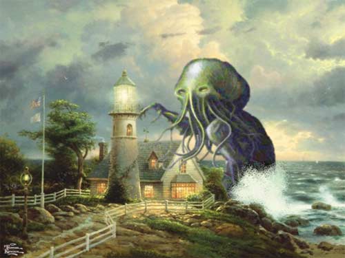
Okay, seriously, there is apparently only one picture of Cthulhu on the entire Internet, and every week at least one person tries to use it. Thusly, I propose this revolutionary idea: don't use it. If you're dying to make a joke about Cthulhu, do like NoneMoreNegative did last week and build your own Cthulhu from scratch. He went to the trouble of making his Elder God out of pictures of things like squids and such. That's dedication. LunixKing here just took that boring old picture and pasted it in like everybody else does, barely even bothering to make it look like it fits in. The only thing this picture lacks is the Olson Twins in the foreground and that fucking doofus who dresses like Peter Pan jumping away in terror. Hey everybody, stop with the damn Cthulhu jokes if you aren't going to put any effort into them. |


Keep reading, pipenose!
This Week on Something Awful...

Pardon Our Dust
Something Awful is in the process of changing hands to a new owner. In the meantime we're pausing all updates and halting production on our propaganda comic partnership with Northrop Grumman.

DEAR FURRIES: WE WERE WRONG
Dear god this was an embarrassment to not only this site, but to all mankind

Let's improve landmarks
Landmarks and statues around the world: old, boring and could use an update.

Make Horror Wholesome
Join the SA Forum photoshop goons in their quest to make horror wholesome!

Every Conceivable Way EA Could Screw Up Star Wars: Squadrons
Yes, there are finally enough games for a new round of One Sentence Reviews
About This Column
Photoshop Phriday showcases the tremendous image manipulation talents of the Something Awful Forum Goons. Each week they tackle a new theme, parodying movies, video games, comics, history, and anything else you can think of. If you want in on the action, join us on the Something Awful Forums!
Previous Articles
- Paintings of Light (Part 1)
- It Came From Outer Space
- Amusement Park Madness
- VHS Yard Sale
- Holiday Albums, Vol II